
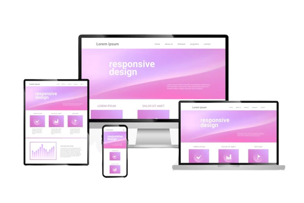
In today’s digital-first world, a website that adapts seamlessly to any device is no longer optional—it’s essential. Responsive website design ensures users enjoy a smooth browsing experience, whether they’re on a desktop, tablet, or smartphone. To illustrate the power of effective responsive design, let’s look at five brands that have truly mastered it.
1. Apple
Apple has long been a benchmark for design excellence, and its website is no exception. Their responsive website design ensures that product pages, multimedia content, and navigation menus scale beautifully across all devices. High-resolution images automatically adjust to fit screens, and intuitive touch gestures make browsing on mobile devices effortless. Apple’s design approach shows that responsiveness isn’t just about shrinking content—it’s about crafting an experience that feels native on any device.
2. Nike
Nike’s website is a perfect example of responsive website design that combines aesthetics with functionality. The brand prioritizes mobile users by optimizing product displays, interactive sliders, and personalized recommendations. Even on smaller screens, the navigation remains intuitive, and calls-to-action are easily accessible. Nike proves that responsive design can directly impact conversion rates by making it easy for customers to explore products and complete purchases seamlessly.
3. Starbucks
Starbucks excels at creating a consistent user experience across platforms. Their responsive website design emphasizes simplicity and speed. Menus, store locators, and seasonal promotions are all easy to access whether users are on a desktop at work or a mobile device in a café. The fluid layout ensures images, buttons, and text scale proportionately, highlighting that a responsive website design can strengthen brand engagement by keeping users satisfied across devices.
4. Airbnb
Airbnb’s website demonstrates how responsive design can enhance both functionality and user experience. The platform’s search filters, booking options, and property listings adapt perfectly to mobile and tablet screens. The responsive website design ensures that even complex interactive elements, like maps and calendars, remain user-friendly. By prioritizing accessibility and usability, Airbnb proves that thoughtful responsive design can directly support business goals like increasing bookings and user retention.
5. Amazon
Amazon’s responsive website design showcases the importance of consistency in e-commerce. With millions of products available, ensuring a seamless experience across devices is critical. The site’s responsive design adjusts content layouts, images, and checkout flows automatically, reducing friction for shoppers. Mobile users benefit from faster loading times, simplified navigation, and optimized touch controls, reinforcing that responsive design is a key factor in driving sales and customer satisfaction.
Conclusion
These five brands demonstrate that responsive website design is more than just a technical necessity—it’s a strategic advantage. By creating websites that adapt fluidly to any device, brands can improve usability, increase engagement, and boost conversions. Whether you’re an emerging business or an established enterprise, investing in responsive website design is crucial for meeting the demands of today’s mobile-first audience.
 French
 Dutch
Dutch